The Community forums are being phased out in favor of a new Slack group.
Add your email address below to get an invitation to join the community slack group
Using images (SVG, png, etc.) as "radio buttons".
I'm currently creating a form which uses conditional logic to display 1 field at a time. I'd like to present some of the options to be in images with a small text underneath, instead of just plain text with radio buttons or similar.
Is this possible?
April 1, 2018 at 5:35 am
For radio buttons, you'd have to change the label since this is the text you see on the screen. I haven't tried this suggestion, but it's what I would try if I had to use images to meet a client's requirement. I would make sure to use SVG images so they remain clear and crisp at any size.
http://community.formidableforms.com/knowledgebase/frm_field_input_html/
April 5, 2018 at 11:01 pm
Hi Danny,
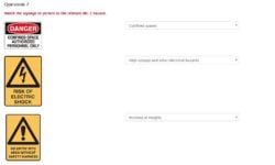
I have a quiz where the visitor has to decide the correct type of sign on display. I display the sign on the left then a dropdown listbox associated with this. See attachment.
To achieve this I create a dropdown listbox in the form as you normally would. Then I save and go to Settings>Customize HTML and scroll down to the section containing html for the dropdown in question.
I insert this code before the main section (swapping domain name and file path for a valid one).
<div id="frm_image_rf" class="frm_form_field form-field frm_top_container frm_first frm_third">
<img src="http://domainname.com/wp-content/uploads/2017/08/150-Danger-Confined-Space.png" alt="" width="150" height="111" class="alignnone size-full wp-image-514" />
</div>
Hope this gives you some ideas.
John.
Attachment:

April 6, 2018 at 10:38 pm
Thanks for the picture. That's a lot easier that tryng to manipulate labels in code. What you would do is use a HTML field to display the image, then the drop down or radio button for the choices. Use the CSS Layout classes on both fields to display the fields next to each other. Alternate between HTML and drop down for all of these choices. It would look something like this in the builder:
HTML (image) / css class: frm_third frm_first
drop down / css class: frm_two_thirds
HTML (image) / css class: frm_third frm_first
radio buttons / css class: frm_two_thirds
HTML (image) / css class: frm_third frm_first
drop down / css class: frm_two_thirds
April 7, 2018 at 3:36 am
Hey guys. Thank you for your suggestions, love how engaging people are here.
So allow me to explain exactly what I meant, as I wasn't clear enough.
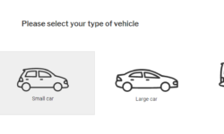
I'm looking to do something similar to the image attached, where the user can click one of the images with small text underneath, and the next question is then revealed.
Is this possible with Formidable or should I be using something else?
Attachment:

April 7, 2018 at 5:38 pm
Hi Danny,
I just discovered something really interesting. In the radio button module where you add titles for your additional radio buttons, this accepts html.
So I was able to get this effect (see attachment). I've only loaded free formidablepro so it doesn't give me the horizontal spread of the radio buttons, but this is a positive start. If its a step in the right direction then its likely a bit of styling will get you there.
What do you think?
John.
Attachment:
 formidable-question.docx
April 8, 2018 at 3:27 am
Hey John,
Thank you for the reply. This looks awesome!
So this removes the actual "radio buttons", and makes the images clickable instead?
April 8, 2018 at 3:49 am
Hi Danny,
No this hasn't removed the radio buttons but yes the images themselves are clickable and do set the radio button.
But when I target the css id for the radio buttons I can make them disappear. Clicking on the vehicle image once the radio buttons are hidden should still set them. and this should trigger the conditional fields that come next. I haven't loaded pro so can't tell for sure, but it should work.
I think to get this to work you will need a little bit of CSS, but probably not too much.
If you load your images to WordPress and use the syntax I provided earlier this will give you a starting point. if you then have a URL with the form visible on we can try and help you fine tune the CSS.
In the Settings>Customze HTML I did add another class name to help identify these radio buttons.
<div id="frm_field_[id]_container" class="frm_form_field form-field [required_class][error_class]">
<label for="field_[key]" class="frm_primary_label">[field_name]
<span class="frm_required">[required_label]</span>
</label>
<div class="frm_opt_container cars">[input]</div>
[if description]<div class="frm_description" id="frm_desc_field_[key]">[description]</div>[/if description]
[if error]<div class="frm_error">[error]</div>[/if error]
</div>
April 9, 2018 at 3:28 am
Danny,
I installed Pro today to look at the interaction with conditional fields. They work but its a bit fiddly. Also when using html like I've done it removes any descriptive tag next to each car. This means that when you set up your conditional logic your list box for the cars will show blanks. They work but they are blank.
I like the idea of keeping the radio buttons positioned along side or beneath the cars but understand that you may want to hide them.
Discussion closed.